Branding essentials for opening a bar, cafe or restaurant
In our latest post we're going to look at some branding essentials for opening a bar, cafe or restaurant.
You are more than likely in the middle of juggling / exchanging contracts, commissioning builders, carpenters and other trades people in addition to making contacts in the industry with suppliers. With all this other 'important' business related humdrum, it is very easy for design elements to be cast aside like a rabid cousin. Let's take a look at what branding essentials are critical to get the doors open.
We've had our fair share of experience branding and marketing lots of new businesses, and food establishments have been something that we have been plugging away at for years. One thing we know is that, no matter what size business you are (or aiming to be), just a handful of branding essentials will see you in good stead for the development of your new place. We've worked with fine dining caterers, nouvelle Indian cuisine kitchens, high-end sole-estate tearooms, all the way through to boxroom sized boutique fishmongers.
So, if you are about to embark on the cafe/bar/restaurant trade then this no nonsense guide will highlight what branding essentials you need to get going.
Fyi - all photos snapped by burningred unless otherwise noted.
1. A name
Oh yes, it all starts with a name. It may sound obvious, but this can be your most time-consuming challenge. It can especially be tricky for partnerships, or when design decisions are made by committee. But get it right and the creative juices can flow without end!
2. Logo / identity / brand
Yep, the next step starts here. We're not necessarily talking 30 page brand guidelines (that can wait for when you launch your franchise / global expansion), but a tight solid identity is what is required. It is essential it will work at a large and small scale, especially something that will be legible from your front window and signage down to stickers for your sandwich wrappers. Add a descriptive yet enticing tagline and you are rolling!
3. Business cards / micro flyers
As soon as those doors open, you want to capitalise on every visit to your establishment. A simple stack of cards on the counter is a sure-fire way to network and build business. After all, everyone has to eat and many a business deal is done over a cup of coffee. Simple design and clear communication of what you actually do on the card is essential.
4. Loyalty cards
Again, this rolls with the point above. The two items could even become one for extra keep-ability.
5. Paper menu templates
Word can be your friend. Get a nice template from your designers and you can be making daily special sheets in no time. Couple that with an attractive creative way of holding the menu, and you are away! For extra environmental brownie points, ensure you source your paper from a reputable source with good sustained forestry credentials (managed forests and replanting uses less energy than 100% recycled board) ... and make sure you recycle your dirty papers and used ink cartridges.
6. Menu
You will need a way to hold your printout menus that you've produced in point 5. There are many options out there: bulldog clips and plywood, leatherette pouches, large print runs of 'one-use-only' menus ... check our pinterest board for several great examples of how to display your menu.
7. Stickers / Tags / Stamps
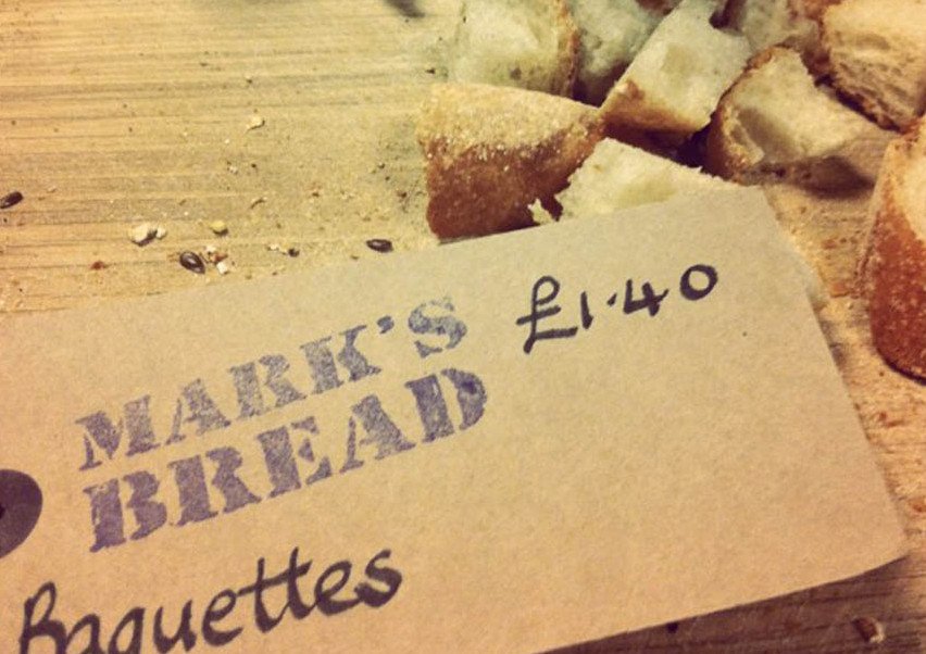
Here, there everywhere.... stickers, tags and stamps are great. They have so many uses. They can turn an empty A4 sheet into a letterhead. A plain piece of parchment paper into a 'proper' sandwich wrap, a plain coffee cup into a branded goblet and useful for adding those brand touches to boxes, deliveries etc. Inexpensive and an excellent way to create brand continuity.
7. Shop signage (front window / hanging signs / window graphics)
Kind of an obvious one, but, we'll get this one out the way quickly ....
Please don't get your printer to design your sign. Seriously.
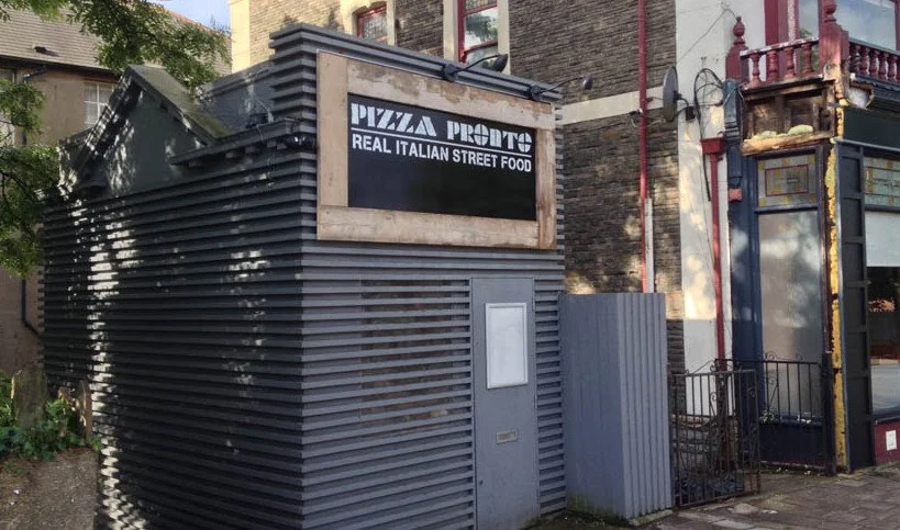
No offence to printers, but you may spawn a monster. A good designer can turn a shop frontage into a thing of beauty and we're certainly not talking about Hollywood budgets here. Strong, clean, fresh design in one or two colours can work wonders. Upcycling is so effective at taking the great forgotten pieces and turning them into a new thang. Check out our pinterest board for some awesome use of colour, shape and typography with shop frontages. Personally I would avoid printing any pictures of food on your boards or any other colour than just one!
8. A-board
A-boards are great. They provide a street-side marketing opportunity to oncoming pedestrian and car traffic. A simple chalk board attached to each side and some nice writing with 'liquid chalk' will work wonders. Just remember to spell check anything you put out on the street or you may become the next instagram meme ... unless of course that is what you are looking to do!
9. Menu board (internal)
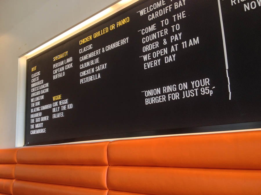
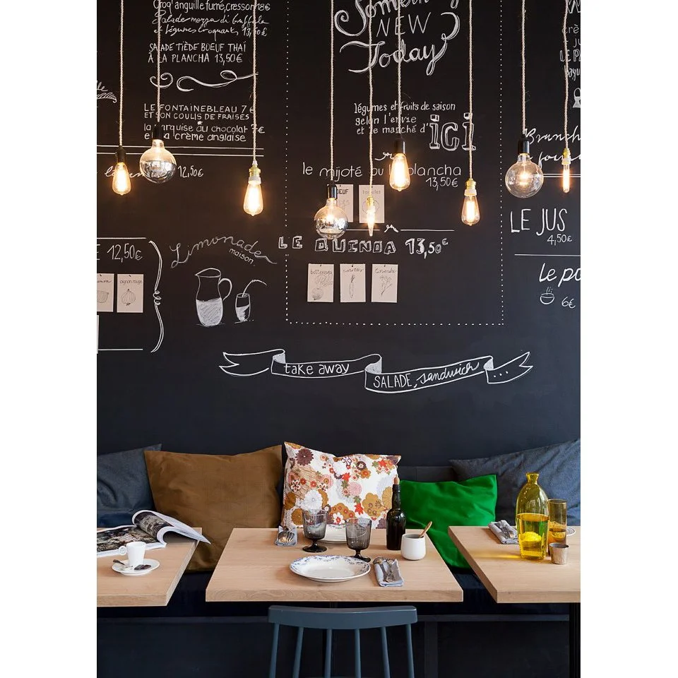
One way or another you have to display what you actually sell. This needs to be done in a clear, concise and practical fashion to accomodate menu changes and additions of your latest cafe-latte-mocha-wuppa-mamma-cino! Take some inpsiration from school. Whiteboards, black boards or even tiles offer infinite ways to display your wares and allow you to amend daily. Our Pinterest board has a plethora of ideas to get your crafty fingers busy.
9. Internal signage
10. Interior Design
Lastly, the interior design of your new place should not be forgotten. It can be the most expensive part of any development of your eatery, and probably rightfully so. After all, you will be using daily and it needs to balance between form and function. Design and branding is about creating flow and continuity and this should extend to the interior. Sometimes all you require is a guiding hand: a colour palette, a selection of imagery, key focal points ... other times a full on theme is required and more exciting zones and themes developed. The best way to work in our opinion, is from a budget perspective. Be honest, what can you afford to spend (not just in monetary terms but also time)? This will help define exactly what you can achieve. Some of the best ideas and results are born out of limited budgets.
Final thoughts
So, there we have it, our roundup of what you really need to consider from a brand / visual point of view when looking at opening your first cafe / bar / restaurant. You certainly can throw a lot of cash at creating the best interior and branding possible, however you can equally create an awesome brand by spending less on some key elements and getting all A-team on your project and upcycling your way to the top!
Need help? Find out more about our branding service.


